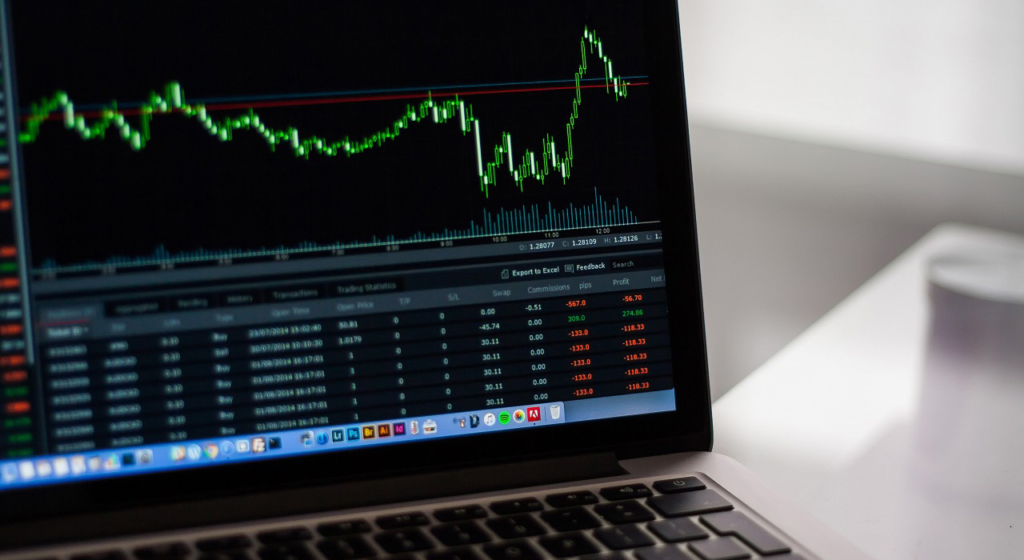
Understanding the world of trading can sometimes be a very difficult task, especially for beginners. When you step inside to explore this topic, there is a great chance that you are going to be overwhelmed by the amount of data present on different forums and websites. You may not be able to understand countless buzz words being thrown at you. In order to avoid such a situation, it is important to learn some trading basics and, what could be more important than learning how to read trading charts, also known as stock charts? Whether you are dealing with currency, options, cryptocurrency or traditional stock trading you will encounter different types of charts. These charts sum up the large amounts of data that is recorded throughout as prices fluctuate. Whether you are short term day trading or a long term investor, understanding trading charts will help your investment decision making.
In this article, we are going to discuss three types of charts and how to read and analyze them.
The line chart
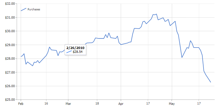
A line chart is one of the most basic chart types used in trading and finance markets. A line chart connects a series of data points with a line. The most common use of this chart type by traders is to monitor the closing prices of stocks or different currencies. These line charts can be used on any timeframe such as days, month or even years. Line charts are focused on a price chart which shows the price movement of the underlying security, or stock, over a period of time. This is also known as price action.
When analyzing a security chart, too much information can overwhelm traders, even the most experienced ones. The term for this phenomenon in trading is called ‘paralysis by analysis’. Using charts that show a plethora of price information and indicators can give multiple signals that lead to confusion and complicate trading decisions. Using a line chart simplifies the identification of the key trends and chart patterns.

A line chart of the closing prices of a stock or a currency gives the trader clear information regarding the price change over a given time period. Line charts only show the closing price thus reducing the noise from other pricing during the trading day, such as the open, high and low prices. Since closing prices of different stocks and currencies are the most significant daily price, it is understandable to see why line charts are popular with traders.
OHLC Chart
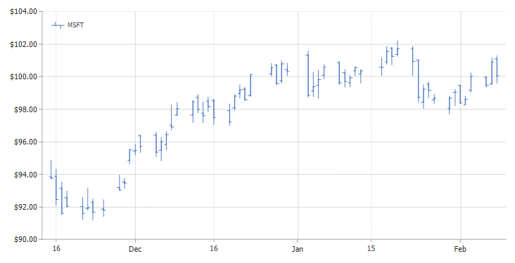
OHLC charts are similar to line charts as they also show closing prices of different stocks and currencies. However, OHLC charts may differ from a line chart due to the fact that instead of showing only the closing price, an OHLC chart also shows open, high, low and closing prices for each period.
An OHLC chart consists of a vertical line marked by two horizontal lines on its left and right as shown in the above picture. The height of the vertical line is an indicator of the intraday range of the period. The high point of the vertical line is the period’s highest price and the low of the vertical line represents the period’s lowest price. The horizontal line extending to the left represents the opening price of the period and the line extending towards the right represents the closing price of the period. All of this combined is known as a price bar.

This chart type is useful because it shows increasing or decreasing momentum. When opening and closing lines are far apart, the graph shows strong momentum and vice versa. The high and low shows the full price range of the period which can help in assessing the volatility. These patterns help traders make decisions on whether to buy or sell.
Candlestick Chart
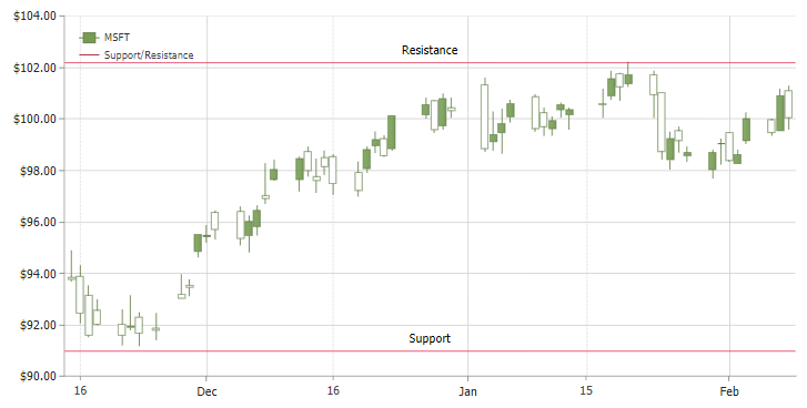
Like a bar chart, a candlestick chart also shows the market’s open, high, low and close price for the day. The candlestick, however, has a wider body than the vertical line in a price bar.
This area represents the price range between the opening and closing price of that particular day’s trading. When the area is filled in, this represents that the close was lower than the open. When the area is empty this means that the close was higher than the open.

Traders can change the color of these areas in their trading platform. For example, a down candle can be shaded red instead of black and up candle can be shaded green instead of white. According to the Japanese who originated the candlestick charts, the candlesticks represent the emotions of the traders and can strongly influence how trade is done.
Moving Average
Stock and trading charts can be volatile, meaning that they change quickly from day to day based on a variety of factors. Some factors may not relate to the stock at all, but global politics, the general stock market conditions, etc. Adding a moving average trend line to a chart can help analyze the stock to smooth out day to day noise and focus on the overall price trend. Moving averages are also used in technical analysis to try and predict future price movements and if there is “support” at a given price.
Support and Resistance
The concepts of support and resistance are two of the most important points in analyzing different trading charts in the field of technical analysis. Traders use these two terms to refer to price levels on charts that tend to act as barriers preventing the price of an asset from moving up or down.

- Support occurs where a downtrend is expected to pause. This is mainly due to increased demand.
- Resistance occurs when an uptrend is expected to pause for a short time. This can be due to excessive supply.
Conclusion
Trading charts offer insights into much more than just stock price. They also show a window into possible trends for the future and help traders make the most informed purchase and sale choices. We hope this short introduction has improved your chart reading IQ and familiarized you with the various types of financial, stock and trading charts. Now that you have done this introductory review, we suggest you explore more in-depth chart analysis. If you would like to see a followup article that digs deeper into this topic, please let us know!
This article is contributed by JSCharting.


